When I began working as a creative director at The Nature Conservancy, I encountered a set of challenges that I later learned were common among many large institutions:
- A lack of unified expression in how the organization presented itself,
- Conflicting decision-making between headquarters and far-flung field offices,
- Uneven human and financial resources devoted to print and media materials,
- Creation of communication products delegated to unskilled staff,
- Materials are outsourced to independent contractors with limited guidance.
These challenges manifested in field programs with different logos, print, and media materials produced in various styles and formats and inconsistent messaging. Some staff liked creating publications despite a lack of expertise, while others saw those products as a necessary but burdensome add-on to their jobs that they’d prefer to pass on to freelancers.
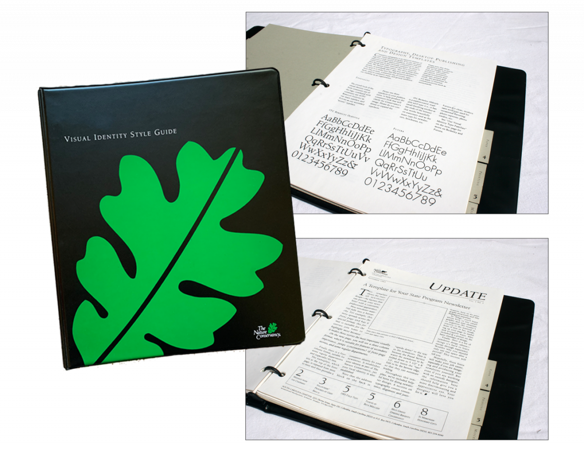
While I had no authority to resolve these challenges structurally, I nevertheless found these problems impeded my productivity. The Publication’s team solution was to make all affected persons’ jobs easier by producing the organization’s first Visual Identity Style Guide. The process involved working across all levels of the organization, from senior executives to administrative assistants, to elicit input and secure buy-in.
The Style guide was designed to be easily updated and expanded as needed. It proved a transformative tool in unifying the organization’s identity across its worldwide offices and programs.