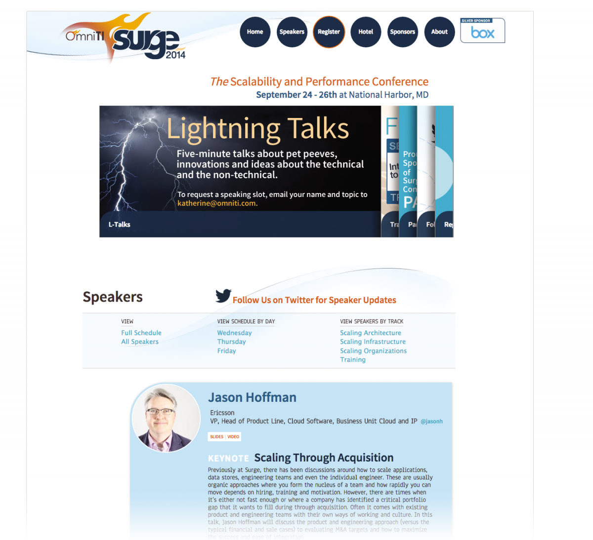
During my tenure as UI Designer for OmniTI, I had the pleasure of working on the website for the company’s yearly conference, Surge. One key element to a successful conference is providing excellent speakers, and that tenet became the guiding principle for UI decisions about the website.
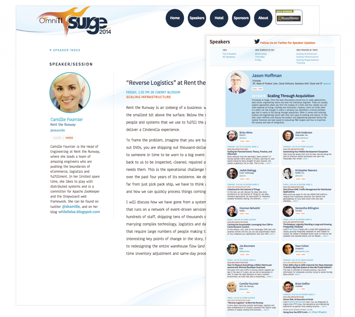
With more than 60 speakers presenting, elegant ways for users to easily access and navigate speaker profiles and sessions were crucial. After exploring different ways users might seek this information, I developed a website that allowed users to filter and view speakers in a variety of categories–by day, by one of four tracks (Architecture, Infrastructure, Organizations, and Training), by conference schedule, and as a complete alphabetized list. Speaker and Session pages were combined, reducing the landings and streamlining related information. The Speaker/Session pages were also designed to accommodate links for the presentation’s slides and video post-conference, creating an excellent resource for conference attendees and a reference for future Surge conferences.
